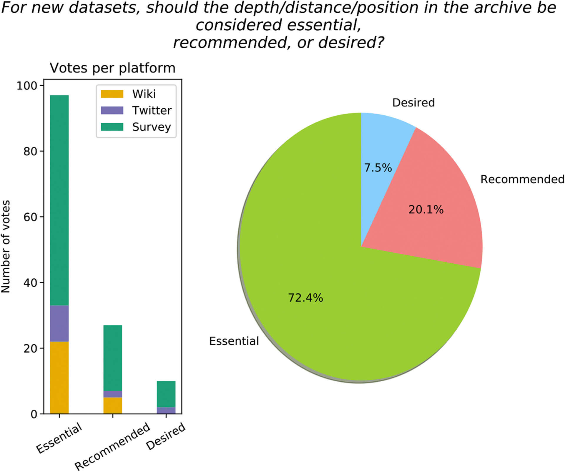
palo20786-fig-0003-m

Rishbha Bhagi

Example of a survey question for a new dataset. The histogram represents the number of votes on each platform (orange: LinkedEarth, purple: Twitter, and green: Google survey). The pie chart represents the fraction of the votes for essential (green), recommended (pink), and desired (blue). Source: “PaCTS 1.0: A Crowdsourced Reporting Standard for Paleoclimate Data,” Paleoceanography and Paleoclimatology.

pie chart of survey question for new dataset

Published on January 9th, 2020

Last updated on January 9th, 2020